Responsive Web Design that Gets Businesses Discovered Online
Let’s face it: the digital age has completely reworked how businesses do marketing.
Before the internet, the name of the game was to put up your sign, get your name in the phonebook, and book a late-night television ad. Then, when the internet took the world by storm, you just had to make a simple website and stuff it with keywords to get found (a practice which is now frowned upon).
Today, both users and search engines have higher standards for the type of content that gets attention online. Though, if you’re not a digital marketer, media group, or search engine specialist, then the standards that Google has might feel uncertain or even completely unknown.
Here at Blue Fire, we specialize in making you a website that potential customers want to use, and Google wants to recommend to potential customers. So, today, we’ll be pulling back the curtain on what makes a strong website get found; that way, your business has the shot it deserves at getting found online. Specifically, we’ll be using this month’s blog post to discuss the ins and outs of responsive design.
Responsive Web Design: In a Nutshell
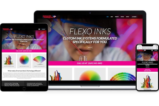
In a nutshell, responsive design is an approach where websites are made so that they can adjust to a wide variety of screen sizes and ratios while maintaining a sense of overall cohesion. Essentially, your website should look just as good on your phone, tablet, and computer screen, despite the content itself not really changing at all.
We value responsive design in digital marketing because, well, the customer values it. When websites are accessible and easy to use, potential customers will use them more often and for a longer period of time. When search engines like Google see that people like to be on your website, then they’ll recommend your website more often, essentially keeping the ball rolling and making sure that your website (and therefore your business) is discovered more often.
Google like sites with responsive design because they keep people using Google longer; users like websites with responsive design because they’re fun and easy to navigate; websites strive for responsive design because they get more (and happier) customers that way. Therefore, it’s really a win-win-win scenario to integrate responsive design into your site.
Elements of Responsive Web Design
Now that we’ve thoroughly extolled the virtues of responsive design, that leaves one question: what, exactly does responsive design look like?
This question has both a simple answer and an elaborate one. Most commonly, simple elements of responsive design are choices such as:
- Pictures that resize based on screen size
- Layouts that reconfigure to adapt to screen ratios
- Text that automatically formats based on the user’s needs
If you effectively integrate these ideas into your site, chances are you have pretty great responsive design. The difficulty is, though, that every site requires a different approach to make it responsive while still holding up. This is where the elaborate answer comes in.
Essentially, the elaborate truth is that responsive design isn’t a technology: it’s a style. Every web designer does their responsive design differently, and each design usually comes attached with its own design philosophy.
Here at Blue Fire Media, we have our own design philosophy. Our philosophy is to make websites that get you noticed and that potential customers of all backgrounds and on all devices like to see. If you’re interested in responsive web design done by the professionals, don’t hesitate to contact us at Blue Fire Media today. Together, we can help your business make its mark on the internet.


